Let Me Count the Ways!
This is a repost of a some information I posted to the ComputerScrappingElements3@yahoogroups.com email list. If you're looking for a great list devoted to digital scrapbooking, with a large group of users with different applications and experience levels but common goals, this is a good list. Members create and share their own scrapbooking elements, and the list permits NO
ADS.
The challenge was to colorize the elements in the kit found HERE, using any image editor, in any color, and then repost the elements with instructions how you did it. Following is my post -
<For those of you with Photoshop , Photoshop Elements or PhotoPaint, you have most of the
same tools (and some different ones) to effect the same sort of changes, so
you might want to read this anyway.>
I'll use the Infamous Yellow
as my target color along with a more difficult image - the tack, which is
highly textured. The objective is to change the color without affecting the
text. All of this images start with the base image as a background layer.
(All commands and tools refer to their menu placement, etcetera, in PSP X.
Those same commands are all in PSP 8 and 9, t o, just moved around. In
addition, due to development
changes in the engineering of PSP 9 and much more in X, there may well be
significant differences between the color you get in PSP 8, 9, or X, using
the same darn values. Don't blame me and don't think you're doing anything
wrong. It's company politics, oh joy. ;-))))
Use the image below to
refer to, to see the effect produced using each method. In some cases, I
modified things INTENTIONALLY so it would look different, but you'll see
that. The gray tack image is the original in all cases. Why are they (mostly) all
different? Because some of the processesare done on the RGB color space, and
some in HSL. In addition, some of the HSL adjustments only affect H, or H and
S, or H and S AND L. I highly encourage all of you to try this same exercise
yourselves, to get a feel for what method you like best. Or maybe just
knowing how all are done, will allow you to use different methods to achieve
the end result.
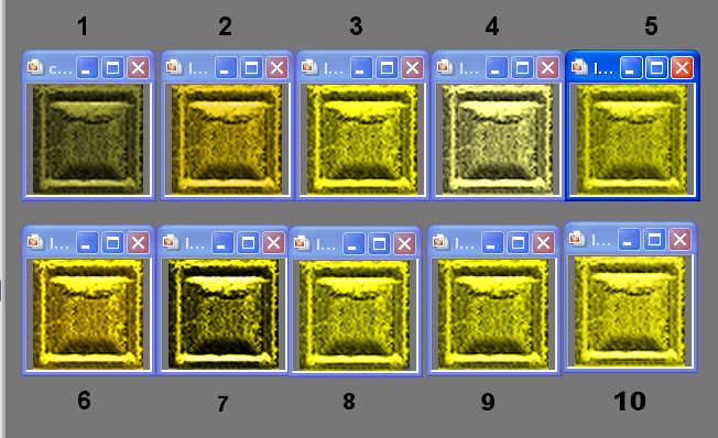
1. Adjust>Hue and Saturation>Colorize. Set the Hue
and Saturation using the slider. (This method will not alter Lightness values
- so if you try to colorize a dark image to a light color, or vice versa,
this won't work very well.) Here I've used a Hue of 42, Saturation 128.
That's about as yellow as this particular feature will get this
image.
2. Adjust>Hue and Saturation>H/S/L adjustment. Here I've
checked the "colorize" box, set the hue to "52" (because 42 gave me a lovely
peachy orange!) and boosted the saturation to 90. If you leave the Sat at
0, you'll only see gray. Lightness at -6 made up for a few highlights
that would be blown otherwise.
3. Adjust >Color>Channel Mixer -
Uncheck Monochrome. Set the Output channel to Red. In the Source Channel
slider, push the red to 200, leave G and B at 0. Set the Output Channel to
Green. Set the Green slider to 200, R and B at 0. In the Blue Output channel,
leave all three sliders at 0.
4. Adjust>Color>Red/Green/Blue - set
R at 100%, G at 100%, B at 0.
5. Layers>New Adjustment Layer>Color
Balance. For each Tone Balance radio button, set the Yellow/Blue slider all
the way to the left. Check Preserve>Luminance.
6. Layers>New
Adjustment Layer>Channel Mixer. This dialog is just like the>Channel Mixer
dialog in the Adjust menu, but it gives you the advantage of being able to
modify the layer properties like opacity and blend modes. In addition, if you
want to go back and tweak the color adjustment, you can do it directly to the
Adjustment Layer by clicking on the the layer title in he Layers Palette,
which will re-open the dialog, allowing you to tweak away. Just to show
something different, I added a setting of 75% to the green slider IN THE RED
CHANNEL, and about 25% Red IN THE GREEN CHANNEL, as well as the settings in
step 3 above. I also set the Channel Mixer>Adjustment Layer blend mode to
"Color."
7. Layers>New Adjustment Layer>Hue/Saturation/Lightness.
Dialog is exactly like the HSL adjustment in #2. I've used a Hue value of 58
here, even hough yellow should be closer to 42... call it "color anomalies
in PSP." I've set the Layer blend mode to "Overlay" here, which I think
yields a sorta old-roughed-up but still kinda shiny cheap kinda brass
color. Sortakindamaybe?
8. Change to Target brush (found on the Retouch brush flyout of
the main Toolbar, unless you've customized PSP to put it elsewhere.) Set
your foreground or background color to R255 G255 B0. Use the brush to paint
the new color right on the image. You can use this quite nicely to
selectively spot-colorize.
9. Layers>New Raster Layer. Activate
this layer in the Layers Palette, and fill it using the Flood Fill tool with
R255 G255 B0. Set the Layer Blend Mode to "Color." Alternately, set the Layer
Blend Mode to "Color (Legacy)." There's a definite difference, but it's too
complicated for this discussion. Just pick the one you like for the image
you're working on.
10.This last one is a bit more difficult, only because
Corel hid the tool so you have to dig it out first. If you know how to
customize your workspace in PSP X, go to Unused Commands, find the Manual
Color Correction tool. Install it on a toolbar. Click on the icon to open the
dialog. In the left preview pane, use your mouse cursor to drag out a little
square sample for PSP to use as your "source" color. You should see this
change in the Source chip - it will be black or gray for this image. Click
the Manual Target Color radio button. Set the Hue to 42, Saturation to 255,
and the lighntess to 9o (128 will be too light for this image, all the
highlights will be blown.) Click OK to apply.
Phew, ten count 'em ten ways to colorize, in Paint Shop Pro. Let's move on to another aspect of changing image colors!
PART TWO