Now
for some goodies, to help along your way to writing the best
tutorials you can possibly produce!
Always
start your tutorial with mentioning the software and plugins
you will use, and the authorized sites where the visitor can
obtain either demo versions, freeware or shareware, or purchase
full versions. It's also a good idea to show the visitor
a version of the completed project at the beginning of the tutorial.
If the image is large, thumbnail it and link to the full-size
version, or slice it up and put it in a table. Nobody
likes to wait for large images to download. Most web editors
have a tool to make thumbnails, or you can obtain a freeware
thumbnail utility such as Easy
Thumbnails.
Many
screen captures should be saved as .gif format, not .jpg. You
might try sharpening the capture a bit before exporting it as
a .gif. Paint Shop Pro has it's own built-in Screen Capture
feature (here's a good tutorial
for that ;-)))), or you can use a separate utility such as SnagIt
or HyperSnap.
Something
many viewers find helpful, is the use of screen captures of
the PSP tool palette icons inserted in your text whenever you
refer to a tool, especially the first time you refer to it.
For instance, if I want the reader to click on the Crop
tool  I can insert a little screen capture like I just did. You
can also add an ALT tag to your image in your HTML, so that
when the reader mouse-hovers over the icon, the name of the
icon appears, just like it does in PSP! I've made it easy
for you, I've captured and cropped all the PSP 7 tool palette icons
and zipped them up in one neat little file, so you can use the
individual .gif's in your tutorials just like I did in this
paragraph. There's a single icon for each tool, and a
capture of the entire tool palette, should you need it.
I can insert a little screen capture like I just did. You
can also add an ALT tag to your image in your HTML, so that
when the reader mouse-hovers over the icon, the name of the
icon appears, just like it does in PSP! I've made it easy
for you, I've captured and cropped all the PSP 7 tool palette icons
and zipped them up in one neat little file, so you can use the
individual .gif's in your tutorials just like I did in this
paragraph. There's a single icon for each tool, and a
capture of the entire tool palette, should you need it.
Download
HERE
A
pet peeve - don't bother watermarking screen
captures of software dialogs. The dialogs belong to the
software companies, it's not kosher to watermark them with your
personal watermark. In addition, watermarking often obscures
the information on the dialog, making it hard for the viewer
to read. (I can point you at two dozen sites right now
with watermarks plastered all over the dialogs. Who are
they kiddin? ;-))) If you want to watermark your completed image,
go right ahead, that's YOUR image. Just leave the dialogs
alone!
Try
to leave some "white space" around your text
blocks, don't cram everything into one spot. Think of
your tutorial as a page in a book, and try to make it easy for
your visitor to read what you have to say. Left align
text blocks (resist the urge to center align everything
because it looks so symmetrical with your pretty images! It's
hard to read that way!) Use tables in your HTML
file, to help align text blocks and images. Just don't
put cluttered distracting background images in those tables,
that defeats the purpose!
Forget
about fancy fonts in your text. If you want to use a decorative
font, use it in an image (like I did with my header images on
this page.) Use a "default font" as your
text font, it will be easier for your viewer to read. If you
plan your text around a fancy font that you have on your own
system, and your visitor doesn't happen to have that font installed,
they won't see it the way you do, anyway, so save some time
and aggravation all around!
If
you would like to use the Jasc Paint Shop Pro web buttons as
image links, like this one  - you can find several styles at this link.
Speaking
of links - check them! Try to limit the number of external
links, especially non-commercial ones. Tutorial sites move frequently,
and you don't want to be stuck with a bunch of dead-end links,
particularly if it's information your visitor will need to complete
the tutorial.
Never
never NEVER offer a file for download that doesn't belong to
you! If it's not your tube, or preset, or plugin filter,
direct the visitor to the site where it can be obtained. Nothing
will get you in hot water faster than offering up a resource
made by someone else, as a download on your site, without permission.
SPELLCHECK!
F7 is your friend! Nothing turns off visitors
faster than poor spelling and bad grammar (now you watch, I'll
have 3 typos in here... ;-)))) If you aren't using software
with a built-in spellchecker, here's a free
online one!
When
you finish your handiwork, you can put a copyright statement
on the page, although technically, that is not necessary. As
soon as you produce an original work, it's copyrighted to you
(but proving it is a separate issue, and one I am not willing
to tackle here!) A simple copyright symbol and your
name, or the site name, is fine. If you have specific
requirements about how your material can be used by others,
it's fine to state it, but keep it brief and professional.
How
do you make that little © symbol? Quickest way - click
on the ALT key while you type in 0169 on your numeric
keypad (not the number keys over the QWERTY layout.) On
some systems, you may have to turn NUM LOCK off, as well. You
can also use another well-kept Window secret, the Character
Map. Click on Start/Programs/Accessories/System Tools
(or some variation thereof, based on your flavour of Windows
operating system!) and then Character Map.
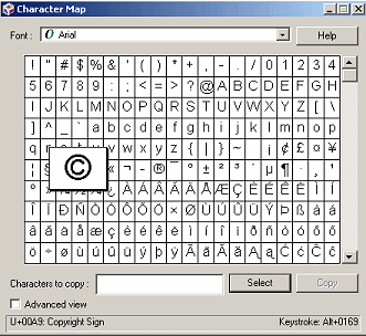
Windows
2000 Character Map
You
can find the keystrokes for the symbols for any font installed
on your machine, as well as any special characters the font
contains. You can click on the symbol and then view the
keystroke combination in the lower right corner, or you can
click on the symbol(s), push the "Select" button to
display it in the "Characters to copy" dialog, and
then click "Copy" to copy it to the Windows clipboard,
where it can be pasted into just about any application.
Make
sure you put an email link. Sometimes your visitors
need a little help, but more often than not, they want to say
"thank you" and tell you how much they enjoyed your
site. You'll like to hear that, it will encourage
you to provide even MORE helpful information! If you are
uncomfortable giving your "official" email, get a
Web-based email address, and use that as your email link address.
Now,
you've completed your tutorial, and it's almost ready for your
adoring public. It's a good idea to have a couple people run
through the tutorial, making sure the steps are clear, and that
the results are consistent. Then, it's CURTAIN TIME! Have
fun!