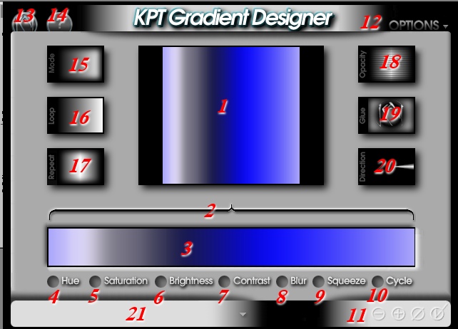

|
|
|
|
|
|
|
|
|
|
|
|||||||||||||||
| Now we need to fine tune our
gradient, we are satisfied with the colors, but don't care for the
striations, or the black and white sections...
|
|||||||||||||||
|
|
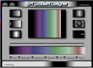
Click on the Cycle button (#10).
Drag to the right, and watch the color sequence move within the color
bar. The black and white sections will move toward the center.
Drag to the right til the color cycle reads about 130%. This puts my
green shades on both ends of the gradient, with black and white in the
middle. Now, I can either drag the bracket down to just that section and
substitute a new color in that segment, OR, I can use some other features
to finetune the gradient.
|
||||||||||||||
| Move the bracket ends to encompass
the area of the gradient you want to change, in this case, the section
with the black/white area. Click on the Blur button (#8).
Drag to the right and watch the pixels in that area begin to intermingle
and blur the colors in that segment. If you start to get a hard edge
at the point where the bracket defines the affected area, move the bracket
out a bit more, and blur some more! You can finish by extending the
bracket the entire length of the color bar, and adding just enough blur to
smooth out any striations you may have left.
|
|
||||||||||||||
| Now you say, yeah, Diz, but I
WANTED the purple area on one end and the bronze color on the other, not
the darn greens!!!! And I say, FINE, be that way, Cycle it (10#)
back the other way! Are you happy now?????
|
|
||||||||||||||
| Well, not QUITE, you say, cause
you'd really like that bronze section to be a bit wider. Sheesh,
never satisfied, are you? Well, you just SQUEEZE it (#9)
til you get it the way you want it! Click on the Squeeze button,
drag to the left to increase the color from the right side, drag to the
right to increase the color from the left side!
|
|
||||||||||||||
| Clicking on the Contrast button (#7)
and dragging to the right will increase the contrast between the colors in
your gradient. Dragging to the left will decrease the contrast, and
will eventually turn all the colors one uniform shade of gray, but what
the heck would be the point of that in a gradient, I ask you?
Clicking and dragging the Brightness button (#6) to the right will increase the brightness of your gradient (add more white to the colors.) Dragging to the left will, you guessed it, decrease the brightness! Clicking and dragging on the Saturation button (#5) to the right will increase the saturation of the colors in your gradient, producing clearer tones of your colors. Dragging to the left will add more gray to each color, turning the entire gradient grayscale at -100% Saturation.
|
|||||||||||||||
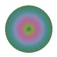
| Clicking and dragging on the Hue
button (#4) will give you lots of neat
results! This effect takes your existing gradient, and cycles
through all the colors of the spectrum, while maintaining each color's
relative position from each other on a virtual color wheel. Sounds
complicated, but what it means is that each gradient's colors are
infinitely variable! This gradient to the right is the same as the
one above, with a Hue adjustment of 150% applied.
|
|||||||||||||||
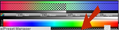
|
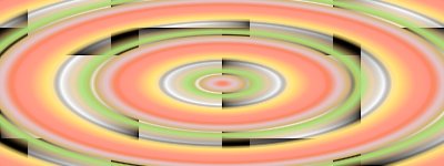
It's also possible to insert transparent areas within the gradient, so that when it is applied over an image or pattern, parts of the image show through the gradient. Choose the transparent area all the way down to the bottom of the color picker, and make sure you have the bracket set on the top of the color bar to limit the transparent area to the spot you want it on the gradient. Here's an example of a gradient with a transparent area in it, used as a Elliptical Sunburst over a black and white basket weave pattern.
|
|||||||||||||||
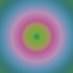
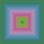
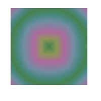
| Okay, we have this lovely color
combination, but somehow, it's just not enough, linear is boring! We
want SHAPE!
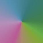
Fine, fine. Click on Mode (#15) and cycle through the gradient shapes. Circular and Elliptical Sunbursts, if applied to a square selection, will look exactly the same, as will Square and Rectangular Bursts. The Ellipse and Rectangle need to be applied to a rectangular selection to see the difference. These four modes use a core-to-perimeter alignment, meaning the color to the left of your gradient will be in the center (core) of your image, and the right most color will be along the perimeter (outside edge) of your image. The Radial Sweep Mode is similar to the hands of a clock traveling around the dial.
|
|||||||||||||||
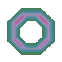
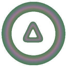
| The Angular and Circular
Shapebursts conform to the shape of the selection they are applied to.
|
|||||||||||||||
|
Angular Shapebursts applied to
|
|||||||||||||||
|
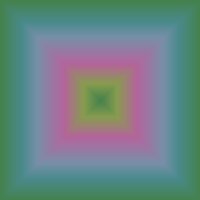
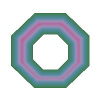
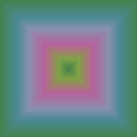
Octagonal selections |
Square selection |
Circular selection |
|||||||||||||
|
|
|
|
|||||||||||||
|
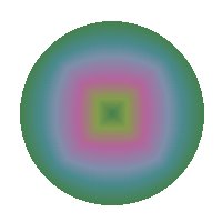
Circular Shapebursts applied to
|
|||||||||||||||
|
Octagonal selections |
Square selection |
Circular selection |
|||||||||||||
|
|
|
|
|||||||||||||
|
The interior of the gradient patterns on the Circular Shapebursts is softer and more rounded than the Angular Shapeburst patterns. The Angular and Circular Pathbursts work in a similar fashion, but affect both the inside and outside of your selection. The outer area affected by the pathburst is a rectangle who's height and width is determined by the height and width of your selection. If you want the pathburst to fill your whole image, just invert your selection before applying the mode.
|
|||||||||||||||
|
Angular Pathtburst on a circular selection |
Circular Pathburst on a circular selection |
Circular Pathburst on an inverted circular selection |
|||||||||||||
|
|
|
|
|||||||||||||
|
|
|||||||||||||||
|
Grayscale Mapburst, well, to be honest, I haven't got that one figured out yet, hmmmmmmmmm... I'll get back to you on that one! However, Gradients on a Path... apply a feather to a selection, and then apply the gradient using the Gradients on a Path mode, and the gradient will follow the path of your marquee inside your selection! |
|
||||||||||||||
| Hope you've enjoyed learning about the Gradient Designer in KPT 3! For more KPT information, check out the FIlter Frenzy 2 class at LVS Online. | |||||||||||||||
|
© Sally Beacham and Dizteq.com 1999-2001 |
|||||||||||||||