Okay folks,now it's time to put some of those presets to work! I did these images with PSP 6 , but I don't believe I did anything you can't produce exactly with PSP 5. I am including 2 fonts, 2 presets, and a tube with this lesson, talk about goodies! If you wish to duplicate these effects, install these files to your computer.
The Gold Sapphire preset and the Metalish2 preset are from Sara Froelich's site at Northlite Designs. Thanks to Sara for her lovely work!
Unfortunately, I can't remember where the other goodies came from, other than to tell you they are not mine. If the authors would like credit, please email me and I'll be happy to do so.
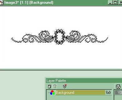
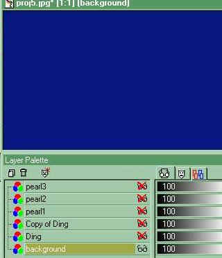
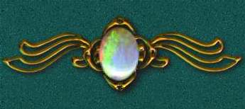
Open a 400x200 image, transparent background, 16 million colors , Add new layer (raster layer if you are using PSP 6) and name it Ding. Apply text tool, font is Separates, letter "o," size 72, floating on, antialias checked, black text.
Center dingbat in image, go to selections/modify/expand, expand by 2. With the dingbat still selected, flood fill the text with a medium gray.
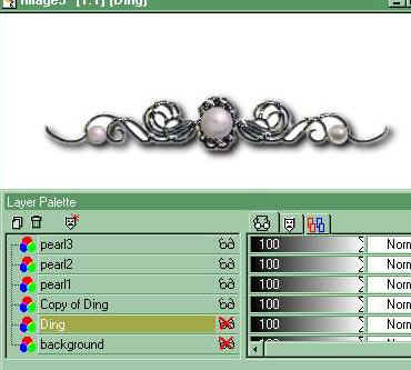
Apply BP preset metalish2. Add new layer (raster) name it pearl1, control D ( or select none, to deselect the dingbat) apply pearl (graywhite) size100 to center of dingbat.(Make sure the pearl1 layer is the active layer by clicking on it before applying the pearl.)
Add layer, named pearl 2, apply pearl (same color, size 60) to left loop, add layer named pearl3, apply pearl to right loop.
Right click on Ding layer, Duplicate.
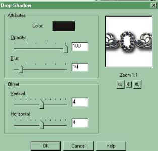
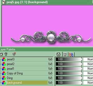
Use this Copy of Ding layer to apply a drop shadow to the dingbat. If you change the orientation of the dingbat when you use it on your stationery/web page, you may wish to change the drop shadow direction so that your images seem to have the same light source. By changing this layer, you will be able to easily apply the effect within the image (as long as you save the original with layers intact, in .psp format.) Select the dingbat with the magic wand, tolerance 90. Image/Effects/Drop Shadow with the following settings:
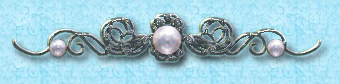
You will also be able to easily change the background color the ornament is applied to by coloring the background layer only, like so -
or so -
Save the image as a .psp file, with layers intact and then save it as a .jpg with layers merged. Resize this .jpg image - Image, Resize, percent of original, maintain aspect ration, as necessary for use in your stationery or web document.
- To make a bordered web tile
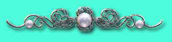
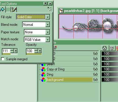
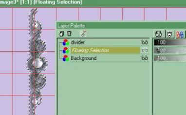
Open a new image 1200x250, white background, 16 million colors. It's important to make a tile wide enough to accommodate the various screen resolution sizes at which people will view your page. In the case of a vertical border tile, if you make the tile width too short, the image will tile again before the right hand edge of the screen. I have made this tile 1200 wide to acommodate those viewing at 1024x768. It will also tile well at lower resolutions, however you pay for that in the larger file size, so if you DO decide to use a large background tile, keep in mind the other image sizes on your page to keep the download time lower. Most people still view at 800x600, so keep that in mind as well. People hate a horizontal scroll and I fear these lessons are doing it for a lot of folks. Anyway, on with the project! Go to View, Grid and turn the grid on, to give you a good idea where you want the border. If the grid is too large or too small to be of any use, go to File, Preferences, General Program Preferences, Rulers and Units and set the grid at 50 or 100 horizontal and vertical. Add a layer to your image and name it Divider. Open your .psp image of the dingbat, complete with layers and dropshadow. It will look something like this -
Open the layer control palette for this image, click on the background layer to activate it, then flood fill it with the color of your background.
Go to Image, Resize, Percentage of Original 80%, maintain aspect ratio. Go to Image, Rotate, rotate 90 degrees right. Save your new image as a transparent .gif, with your new background color as the transparent color. Go to your larger background tile image, activate the background layer and flood fill it with the color you used for the background in the divider bar (in this case the lavender.) Then click on the "divider" layer to activate.
Go back to your divider image, click on it to make it the active image, hit CTRL C to copy it. Go to your larger tile image, click on it to make it the active image. Make sure the "divider" layer in the layer control palette is highlighted to show it's active. Hit SHIFT CTRL E to paste the divider in as a transparent selection. Position it using the grid as a guide along the left side edge of the tile.
You may need to resize the divider if it's too big to fit in the tile frame, or crop the excess tile away from the top and bottom if the divider is not quite big enough. If you select the area to the right or left, you can fill that area with a pattern such as I did in the blue version I have used on this page.
You can make matching buttons and divider bars, such as these, to give you a co- ordinated page design. The icons are from Davy's Dingbats. The font I have used in my signature below is my favorite, called Bucephalus. The preset used on this page design is called goldsapphire3. This is a preset I have had for a long time, if the author would like credit, please let me know!
Have fun folks, show me something pretty!
The graphics and text on this site are copyrighted by me, unless otherwise noted. Please do not take any images or text, without my written permission, unless it is specifically made available within this site for download.
© 1999-2002 dizteq